
Most people are not happy with their websites, and there’s a fundamental reason for that—one we often overlook. When creating a website, most of us turn to a website developer, a development agency, or even an in-house team. While they play an essential role, they are not equipped to address the most critical aspects of your website.
Website developers are like engineers trained to fix the nuts and bolts. They are skilled at executing the technical aspects of a website—structuring layouts, optimizing performance, and ensuring functionality. However, they are not visionaries. They don’t come from backgrounds in copywriting, marketing, sales, or strategy. These are the areas that define a website’s ability to communicate your company’s competitive edge, resonate with your audience, and deliver a message that penetrates the market.
The foremost priority of your website isn’t the design or technical implementation—it’s the copy and content. This foundational aspect is what truly drives your website’s effectiveness. Copywriting and strategic messaging should come first, as they set the direction for everything else. The structure and design, the nuts and bolts, come later to support this foundation.
Think of building a website as constructing a house. You don’t start by fixing the bricks in place or arranging the furniture. First, you create a plan, lay a solid foundation, and ensure the base is stable and well-designed to support the entire structure. Similarly, your website needs a solid foundation of strategic messaging and content before you move on to the technical aspects of development.
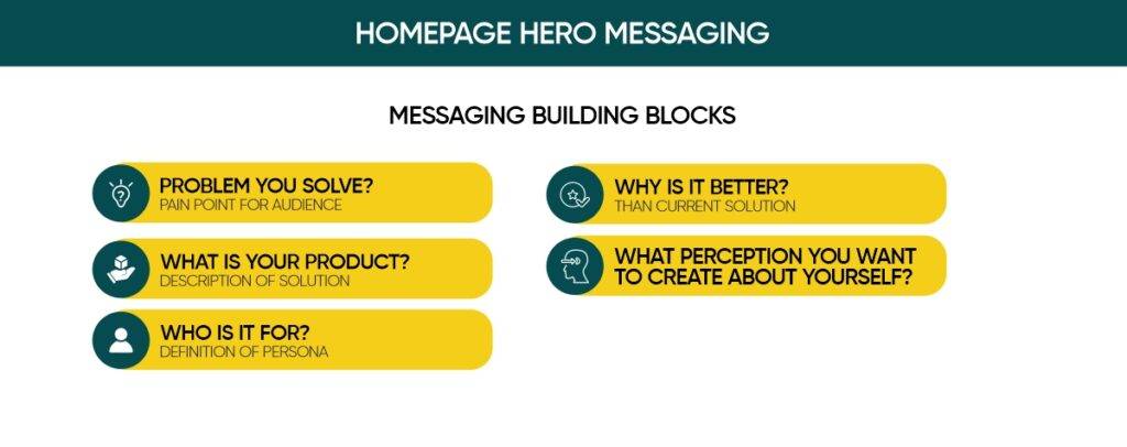
Most websites, especially for early and growth-stage companies, are ineffective in achieving their goals. Instead of broadly discussing this, let’s dive deeper into how you can create a persuasive website—starting with an impactful homepage that tells your story effectively. The first step is to create a simple yet powerful messaging guide. Skipping this step can undermine your website’s effectiveness.
If you’ve read my blog on Perception Marketing, you’ll know it’s more than just a blog—it’s the guiding principle of my overall strategy. Your website plays a pivotal role in shaping perceptions. It establishes the narrative that differentiates you from competitors and communicates why you are the better choice. This narrative should be clearly articulated in your messaging guide.
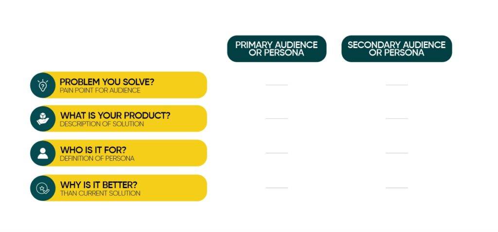
When creating your website, you must identify your primary audience. For example, if you’re a freight forwarder, your audience could include two distinct groups: first-time importers/exporters or experienced importers/exporters. Let’s break this down further:
- First-Time Importers:
This group needs education and reassurance. Your messaging should focus on simplifying the process, addressing their concerns, and providing step-by-step guidance.
- Experienced Importers:
- This group already has established processes and partners. Your messaging for them should emphasize efficiency, reliability, and how you can provide a superior or more cost-effective solution. Here, your messaging should be about your team and your leadership characteristics. How are you training your team? How long is the team working with you? What is the average experience of the team?
Similarly, the focus of your business—whether it’s primarily on imports or exports—should influence your website’s content. For example:
- If Your Primary Focus Is Imports:
- Highlight your expertise and advantages in facilitating imports, while also addressing exporters as a secondary audience.
- If Your Primary Focus Is Exports:
- Tailor the messaging to exporters, showcasing how your services can help them reach international markets effectively. This audience is very interested to learn how to acquire more customers in the international market. At the same time, the import audience is interested in knowing if my money is safe. What if the foreign exporter plays foul?
While it’s tempting to address every aspect of your business, your homepage should prioritize the audience and services that drive the majority of your revenue or align with your strategic goals.
Simply stating, “We are the best freight forwarders in India,” won’t resonate. Instead, focus on creating specific, audience-oriented messaging.
For instance, if 50% or more of your business is from those who primarily export, structure your homepage around export-related services while subtly incorporating information about imports. Prioritizing this way ensures your website speaks directly to the right audience, increasing engagement and conversions.
In conclusion, your website’s effectiveness hinges on listing down primary and secondary audiences. Identify your primary audience, tailor your messaging to their needs, and ensure your homepage reflects these priorities. For more insights, refer to the table below, which elaborates on these strategies in detail.
Here are the additional messaging elements you’ll need:
- Benefits with Supporting Proof:
Go beyond the surface-level “why it’s better” messaging and focus on the specific value or outcomes your audience will gain from your product. Support these benefits with proof points like features, statistics, or tangible results.
- Use Cases and Personas:
Highlight various use cases aligned with your target personas. Depending on your product’s focus, you can either detail multiple use cases for a single audience or tailor use cases for different personas, whether your product serves a vertical (specific industry) or horizontal (broad audience) market.
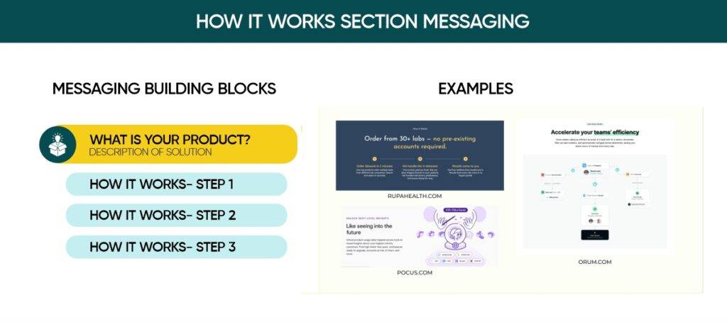
- How Your Product Works:
Break down how your product functions into three clear and straightforward steps. This is especially important if your product is complex or introduces a new category or concept, making it easier for your audience to understand and engage.
Step 2: Plan your homepage layout
Cognitive overload is a common issue in website design, often stemming from poor design choices. For example, using sliders in the topmost section of a homepage—especially those with multiple moving elements—can overwhelm visitors. Sliders, particularly when overused or moving at a noticeable speed, tend to distract users and create unnecessary mental strain.
The same applies to carousels, overly complex user experiences (UX), or cluttered layouts, which all contribute to cognitive overload. These elements divert the user’s attention and make it harder for them to focus on your core message.
Another overlooked yet critical aspect is font selection. Fonts are not just aesthetic choices; they carry meaning and convey subtle messages. Ignoring the role of fonts in your design can diminish the impact and clarity of your website, reducing its effectiveness. It’s important to choose fonts thoughtfully to align with your message and brand values.
Scroll Down for the Wireframe Example
- Top Navigation: Includes links to essential pages like Product, Resources, and Pricing, along with a sign-in link and a prominent CTA button.
- Hero Section: Features the key messaging elements and an optional product screenshot, diagram, or video to capture attention.
- Social Proof Section: Typically includes customer logos, or logos combined with quotes, accompanied by a heading that highlights your customer base.
- Benefits Sections: Showcase 2-3 key benefits supported by product images (stylized visuals or screenshots, either static or animated).
- Use Case and/or Persona Section (Optional): Incorporate one or both of the following:
- Use Cases: Present ~3 use cases, explaining how your product addresses them, often linking to dedicated pages for each use case.
- Personas or Target Audiences: Highlight ~3 distinct personas or Ideal Customer Profiles (ICPs) and the specific ways they benefit from your product, with links to audience-specific pages.
- How It Works Section (Optional): Use a simple, clear diagram to explain your product’s functionality.
- CTA Bar: Reinforce the urgency or value of your product with a concise statement and a primary CTA button. This section should always appear just above the footer.
Note: The sequence of sections between the Hero and CTA Bar can be adjusted to best suit the narrative flow and create a cohesive user journey.
Here’s a wireframe with recommended sections:
Additionally, the essential messaging elements you should incorporate to craft compelling copy for each section.
Step 3: Leverage messaging components to craft copy for each section.
Now, use the approved messaging building blocks to craft copy and content for each section. Refer to the wireframe above for a visual guide on applying these building blocks effectively.
Hero section
Utilize the headline and a concise descriptive paragraph to convey your key messaging: the problem you address, your product’s solution, its target audience, and its unique advantages. Keep the copy focused and limit CTAs in this section to avoid impacting your conversion rate negatively.
Social proof section
The headline in the social proof section of your website is often underutilized, typically saying something vague like ‘Companies love us.’ Make it more impactful by being specific in your copy and reiterating ‘who it’s for.
Use this section, whether featuring quotes, logos, or both, to establish credibility and create a sense of connection, ensuring visitors feel your product is tailored specifically for them.
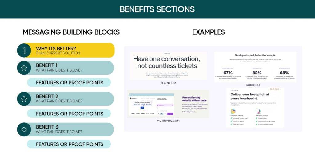
Benefits with proof points sections
Include 2-3 benefits sections with a consistent layout. Together, these benefits should clearly differentiate your offering from competitors. Each benefit should be supported by proof points—such as features or statistics—presented in paragraph or bullet form, as demonstrated in the examples from Guide.co below.
Incorporating product visuals in this section is highly effective, whether through stylized screenshots or GIFs. Screenshots are often more impactful than illustrations or photos, as they provide visual context and serve as an additional layer of credibility.
Many people overthink the distinctions between ‘benefits,’ ‘features,’ and ‘value propositions.’ Instead of getting caught up in semantics, focus on ensuring your three ‘benefits’ clearly communicate why your product is essential for solving your audience’s pain points. Highlight why they should choose you by emphasizing the value or outcomes your product delivers.
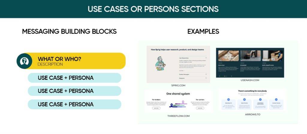
Use cases or personas section.
In this section, provide detailed descriptions of approximately three use cases or audience profiles (ICPs). This will offer deeper insights into your product and demonstrate how it serves various audiences or scenarios. You can include links to dedicated pages for each audience or use case for further details. It’s okay if these additional pages aren’t ready for the initial website launch—consider them as updates to follow soon after.
Suppose your product caters to multiple personas (ICPs). In that case, this section can be an effective way to guide secondary audiences to the most relevant pages rather than trying to address everyone on the homepage. Consider placing this section higher on the page to direct visitors to the appropriate content quickly.
As shown in the examples, there are various layout options, but a straightforward approach is the 3- or 4-column design used by sites like usenash.com and arrows.to.
How it works section
Including a ‘How It Works’ section with a diagram can be highly beneficial, especially if your product is complex, relies heavily on integrations, targets developers, or introduces a brand-new category that doesn’t replace existing technology.
CTA bar at the bottom
Position a concise CTA section just above your footer. This section should restate your core message and emphasize why visitors should take immediate action, whether it’s requesting a demo or signing up. Keep it straightforward and impactful, and create a sense of urgency.
Your homepage can feature additional sections, such as recent press highlights, blog post previews, or badges showcasing security certifications (e.g., SOC 2) and accolades like G2 Reviews. However, for an early-stage site, focusing on the essentials outlined here is a smart starting point.
Step 4: Finesse your copy
Quick note: I’ll avoid using the word ‘finesse’ again, especially in a heading.
At this stage, you’ve identified the content sections for your website and crafted rough copy and visuals using your messaging building blocks. Now it’s time to polish the copy and prepare everything for launch.
Here are 12 practical tips to help you craft a more effective homepage copy:
Know your audience
Understanding your audience is essential for effective marketing, especially when it comes to your homepage. Trying to appeal to everyone often results in connecting with no one.
- Don’t model your website after a late-stage company:
If you’re an early or growth-stage startup, avoid modeling your website after established brands like Stripe or Notion. These companies are widely recognized, and their audiences already understand their purpose. In contrast, as a newer startup, you face challenges in building awareness about your brand, the problems you address, and the solutions you offer. Unlike Stripe, you can’t afford to skip these foundational steps—you need to educate your audience comprehensively.
- Avoid starting with overly visionary statements; instead, focus on clearly addressing an immediate pain point for your audience:
When presenting your pitch deck or during the fundraising phase, founders (and marketers working with them) often focus on the vision, mission, or a fully-featured product before addressing the audience’s immediate pain points. While investors may value your bold vision, most buyers prioritize solutions to their current problems. Buyers also want reassurance that your company is reliable and won’t require an immediate switch. Use social proof on the homepage to establish credibility and reserve founder and investor details for the company page.
- Conduct survey
Address the needs of your primary audience or the majority of your target audience (TAM) on your homepage. To guide secondary personas effectively, use the homepage to route them to relevant pages and create dedicated landing pages for ads and specific content. Over time, consider using surveys to understand visitor preferences better.
Craft clear and engaging copy that sounds natural and impactful when read aloud.
Prioritize clarity over cleverness: For early and growth-stage startup websites, straightforward copy outperforms overly clever language. Avoid crafting overly creative taglines that lack substance. Focus on clearly explaining what your business does.
Never assume people already know about you: As a founder or long-time team member, it may feel unnecessary to explain the basics of what you do—but it’s essential not to overlook the obvious.
Prioritize compelling over comprehensive: Your homepage doesn’t need to explain everything you do. Focus on the primary entry point—your key use case or the most pressing pain point. Avoid overloading visitors with every feature, solution, or use case. While it’s important not to frame your product as overly narrow, trying to cover everything risks losing both clarity and urgency.
Stand out with differentiation: While your homepage can’t cover everything and too much detail can confuse visitors, it’s vital to ensure your messaging sets you apart. Avoid simplifying your copy to the point where it blends in with competitors. For instance, if you’re an early-stage startup competing against an industry giant, focus on what makes you unique. Highlight your strengths, such as a more intuitive or faster experience, and strategically position your competitor’s weaknesses as your advantages. Turn your perceived gaps into compelling positives through your content and copy.
Test it aloud: Read your copy out loud—first to yourself, ideally recording it, and then to someone outside your company, preferably someone in your target audience. This simple practice helps uncover issues you might have missed. It may seem basic, but it’s a highly effective way to refine your messaging.
Copy is just one piece of the puzzle: Pair it with thoughtful design and visuals to enhance your message. Avoid generic flat-style illustrations that add little context—focus on showcasing your product effectively.