Increasing the number of clicks on your website is a task that can be easily accomplished. However, in our efforts to write or design buttons or calls to action, we often overlook simple yet effective strategies that can make these buttons even more clickable. Today, let’s seize these opportunities and empower ourselves with the knowledge to do so.
Today, we’ll delve into some practical strategies that can significantly boost click-through rates. To bring these strategies to life, let’s take a closer look at the homepage of Intercom.com. This website is a prime example of effective button placement and design, and we can learn a lot from it.
The key to a successful button design is to draw attention to it without diverting your viewer’s focus from other important elements on the page. This delicate balance is a challenge, but mastering it is crucial for improving your click-through rates.
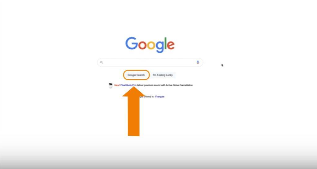
So, if we were to go to the most basic tricks ever, the most basic trick on the planet is to go to google.com.
As marketers, we understand this principle, yet we often allow our pages to become cluttered.
It’s important to note that the button on the far left is typically the one most likely to be clicked.
Regarding basic strategies for increasing clicks, we should concentrate our visitors ‘ attention on one main action.
Additionally, it’s important to recognize that, among identical buttons, the leftmost one is usually the most clicked.
And basic click tracking on your website can help you see which button gets clicked more frequently.
So, we take this fundamental lesson from Google, and then we will build on that.
Another important consideration is whether the click is valuable and qualified.
However, in this blog, let’s talk about getting clicks.
Let’s grab attention and not worry about the second part, which is that good attention.
Let’s focus on getting attention.
So, what is the first thing we can do to get attention?
It starts with colour because we’re trying to get attention.
Do you know why?
It is because we are talking to lizard brain.
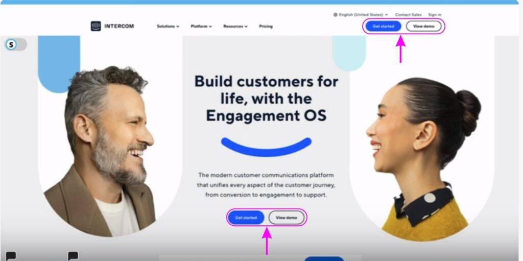
We have one blue button and another colourless button, which change colour when hovered over. Additionally, there are two similar buttons located at the top right-hand side.
If you’re trying to get more clicks, what’s the most effortless click?
Is it to watch a demo?
What’s the friction here?
Or is it to get started?
What’s friction there?
Both of them appear as high-friction clicks. They are not easy.
Getting started is going to come with all sorts of trouble.
Viewing the demo is like asking me to set aside the next 5 mins of my life, which is hard.
But if we were to choose one, which of these two buttons would you choose?
Let’s say it’s the one on the left because, again, we know that it’s more likely to be clicked.
I’ve seen this in heat maps many times, so I’m confident that the buttons in the top right corner get fewer clicks than those in the screen’s centre and the main section.
Which of these two buttons in the central section are most people clicking?
I’ll follow the rule that the left button is clicked more often.
However, if I consider which button has less friction, the one on the right has less friction than the one on the left. It’s still easier to watch a 5-minute demo than to commit the energy to get started.
Nevertheless, I’ll assume the left button is being clicked more frequently.
If it’s your website, you can verify this using heat maps.
How can we increase the click-through rate for this button?
Colour is an opportunity here.
This is why I don’t care when anybody says, “Don’t waste your time on button colours.”
It’s not a waste of time.
It’s a good thing.
This is where an orange would be a really nice contrast.
The basic trick to get more clicks here is something that sticks out and is completely different.
What is the second thing to focus on to get more clicks?
Placement.
You will get more clicks if you remove the two buttons on the top right-hand side.
Rule: There is a sort of banner blindness on the buttons on the extreme top right-hand side where these buttons are.
Most of us, after a certain point at the top, know that when we are ready to navigate, we will go to the navigation.
We have a sort of banner blindness about the headers of a website.
We will now talk about the two buttons that are at the center.
As shown in the screenshot above, since the two faces are looking at each other, we should experiment by placing the buttons between their sight line.
This means we should experiment with moving the buttons slightly up.
Rule: If click tracking or heat maps show most people hovering around a certain area in the top section, it might be smart to place the button nearby.
The rules are not such as they would always work, but it’s a pretty solid trick.
Placing these two buttons side by side can increase clicks. I wouldn’t recommend removing either button.
Rule: The contrast effect, which we’ll discuss later, helps users decide between options rather than whether to click at all. So, it’s beneficial to keep both buttons together.
What is the third factor that can boost button clicks?
Size.
If you want more people to click the Get Started button, make the Get Started button bigger.
It sounds silly, but it works.
Basic tricks to get more clicks.
What is the fourth factor that can boost button clicks?
The copy inside the button.
A nice short verb goes a long way.
In the button “Get Started”, “get” is good. But starting seems like a lot of work.
Rather, Dive in.
Try is good. It’s a nice short verb.
It doesn’t expect much. It allows you to opt-out, give it a shot, not like it, and walk away.
Get is good.
Free is always, always, always, always good.
See/View is good.
Making can be good if the result is happiness, ease, or joy.
If it’s making a table, that’s a bad thing. That’s going to be a lot of work.
Watch is good, as long as it doesn’t imply that your life is going to be spent watching this thing that’s going to take a long time.
When we are writing the copy of the button, we want to complete the phrase, I want to ____________.
I want to get started.
I want to view the demo.
So what is the thing that I want?
Often, the headline will help you with that.
In this case, their headline is :
Build customers for life with the Engagement OS.
So we can also change the copy of the button from :
Get Started > Build Customers for Life.
However, “build” is a scary thing as it seems to be a lot of work.
Customers are intimidating.
But “life” is so far in the future; what I am really solving for right now is acquiring more customers.
Workflow: Every Word in the button should be individually analyzed.
So, I wouldn’t put “Build Customers for Life” on this button even though it is a good practice to take the promise of the headline and repeat it in the button closest to it.
Rule : It is a good practice to take the promise of the headline and repeat it in the button closest to it.
I would rather default to a much easier call to action.
Such as :
It’s easy! Try Now.
It’s Free! Try it now.
Rather than Get Started, change it to Get it now.
Started is a lot of work vs now.
The inner subconscious feeling behind both the terms “get started” and “get it now” is that your life is going to get better.
The other long copy for the button could be :
See how to engage customers now & forever.
Engage sounds less effortful than build. ‘Now and forever’ is better than ‘for life’ because it includes the present.
However, ” See how to engage customers now & forever “is not the basic trick to getting more clicks. It would get you more qualified clicks, which we are not talking about in this blog.
And then, what’s the basic outcome of engagement?
Like, what are we really talking about?
So the button copy can be : make customers happy-easily.
I actually really want to make my customers happy, and I want to do it easily.
If ease isn’t what your prospect values, and they care more about affordability or something similar, then you should use that adjective or adverb instead.
Now, your task is to visit at least four pages on a popular website and rewrite each button on those pages using the techniques you’ve just learned.